UI/UX and Front-End Case Study

Family of Eateries Restaurant Web App

A multi-brand restaurant web app that lets users move between three dining personalities, explore branded pages, and complete reservations inside one responsive experience.

Restaurant identities
Prototype screens
Embedded live app
Restaurant UX Reservation Flow Brand Systems GSAP Motion Responsive Build
Family of Eateries hero visual showing the restaurant web app branding
Family of Eateries front-facing app artwork
Family of Eateries responsive prototype artboard

Overview

Project Overview

Family of Eateries is a restaurant reservation concept built as one shared ecosystem for three different food brands. The experience had to feel cohesive at the system level while still giving each restaurant its own tone, menu atmosphere, and visual personality.

Objective

Design Goal

The goal was to create a browsing-to-booking flow that feels polished and branded instead of generic. The case study focuses on how identity, restaurant discovery, specials, and reservation behavior were combined into a mobile-first interface.

Brand Direction

Three Restaurants, One Product System

Each restaurant needed to feel distinct without breaking the overall app structure. The system keeps the navigation and reservation logic consistent while shifting tone through imagery, color, copy, and branding.

Ceviche fine dining restaurant visual
Fine Dining

Ceviche

An upscale seafood identity designed to feel refined, atmospheric, and reservation-led, with elevated imagery and a more premium visual tone.

Five Vines casual dining restaurant visual
Casual Dining

Five Vines

A warmer, neighborhood-style restaurant experience that balances family-friendly messaging with a more approachable brand voice and layout treatment.

Crispy's fast food restaurant visual
Fast Food

Crispy’s

A faster, bolder identity tuned for speed and appetite appeal, showing how the same app framework can stretch into a more energetic brand personality.

Experience Systems

How The App Works

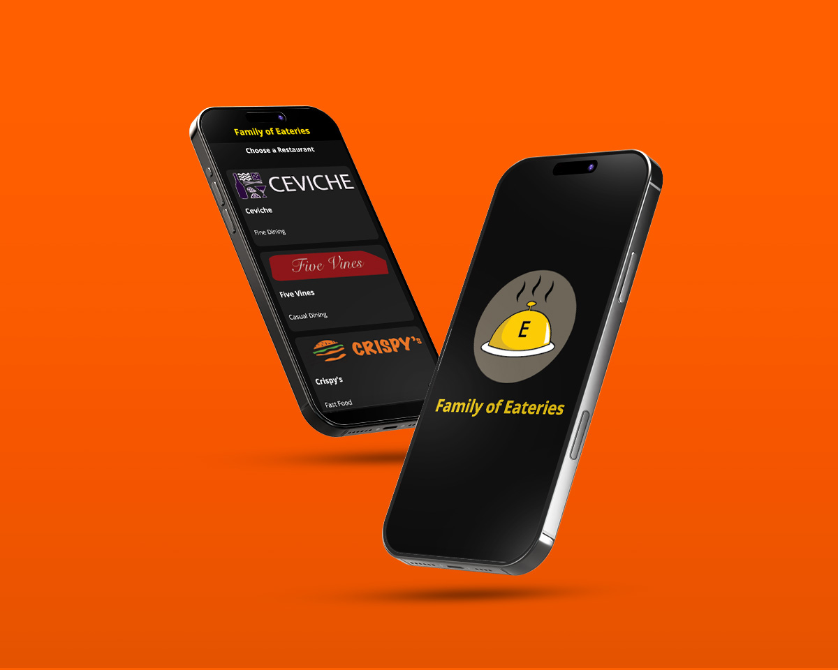
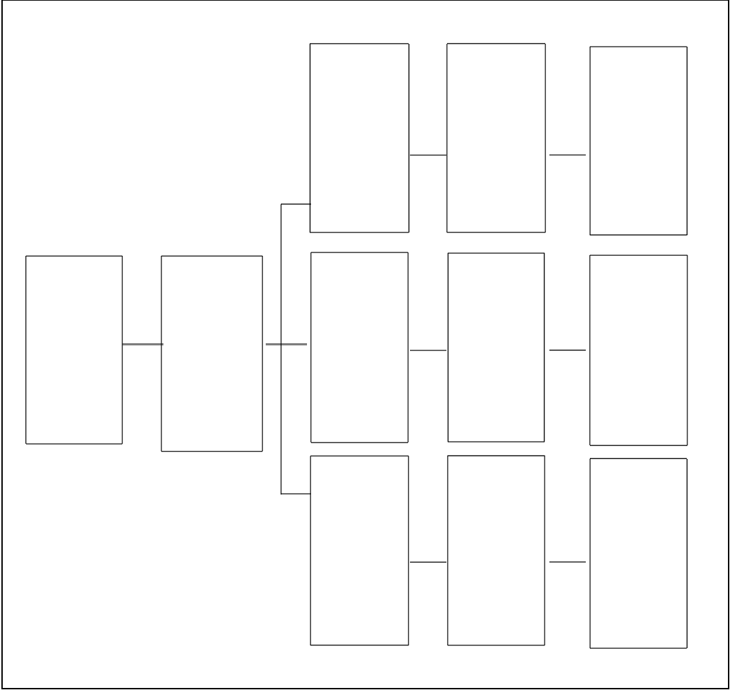
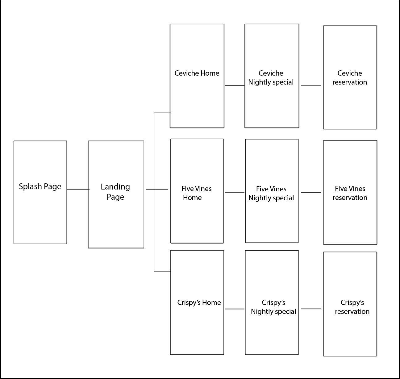
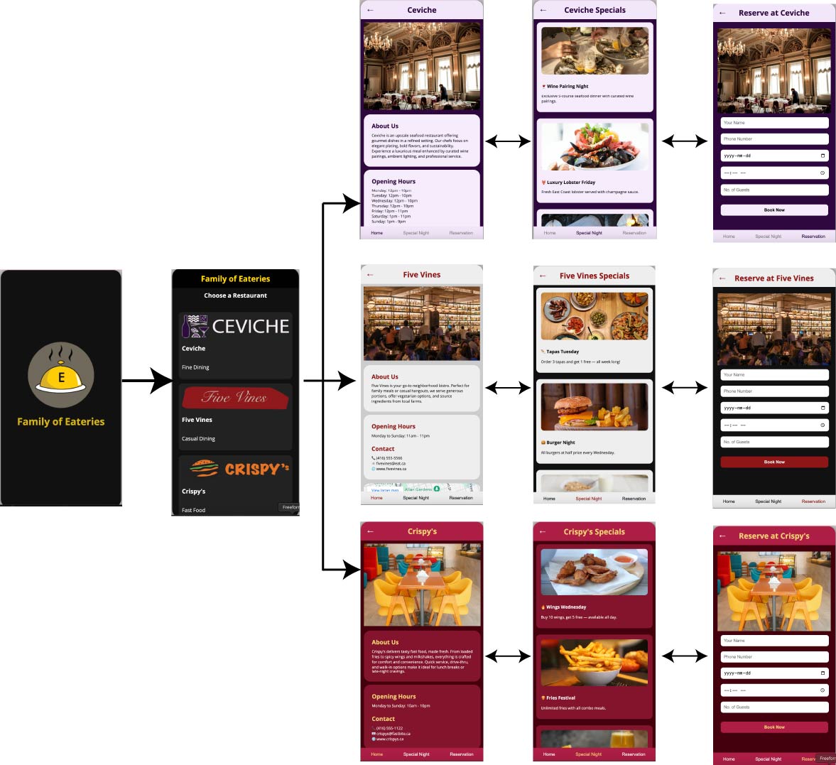
The case study is strongest when the experience is explained as a system: restaurant selection, branded subpages, special-event content, and reservation actions all follow the same underlying logic.

01

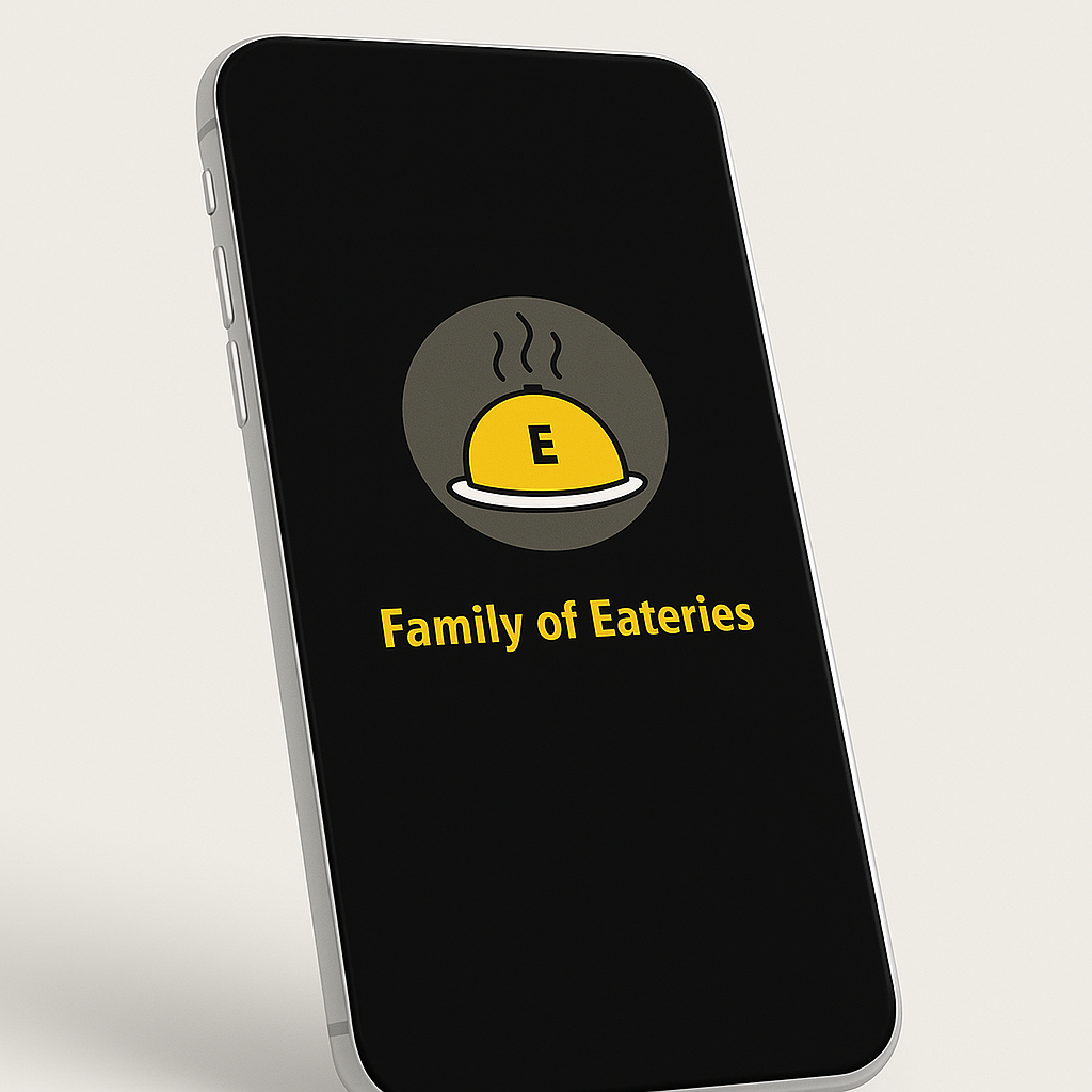
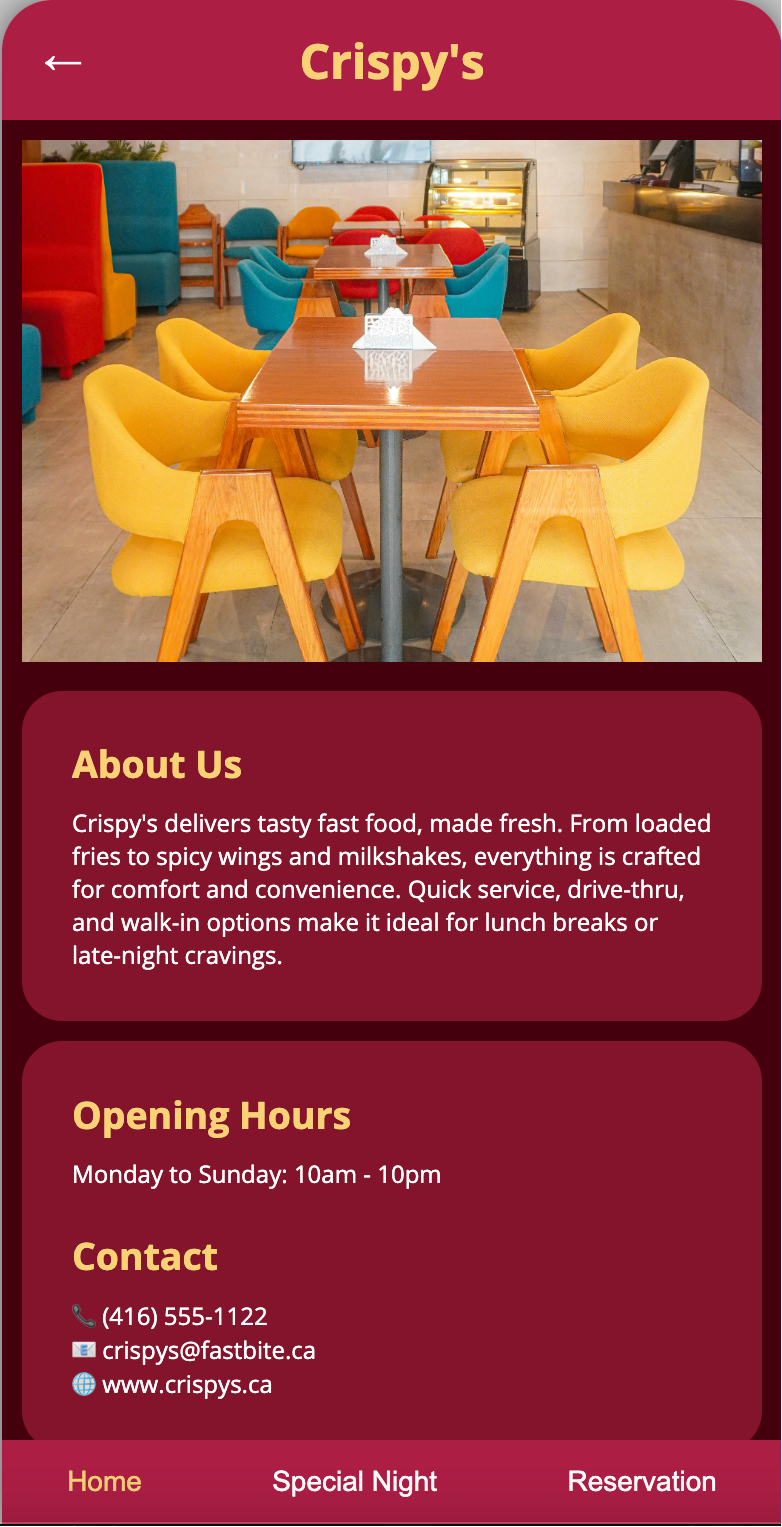
Restaurant Selection Hub

The landing state introduces the app as one family of restaurant brands and lets users enter the experience by choosing the dining style that fits their intent.

02

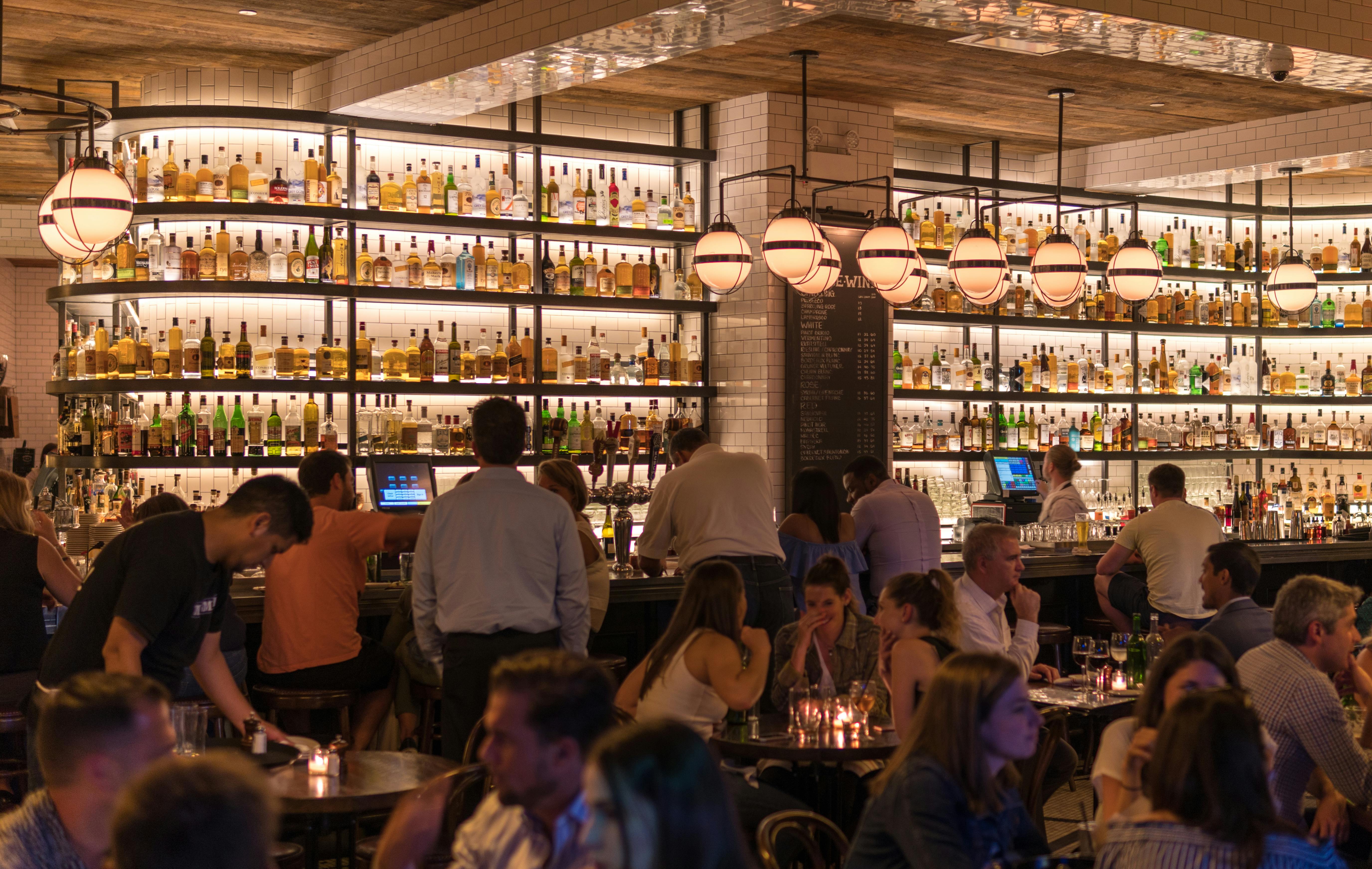
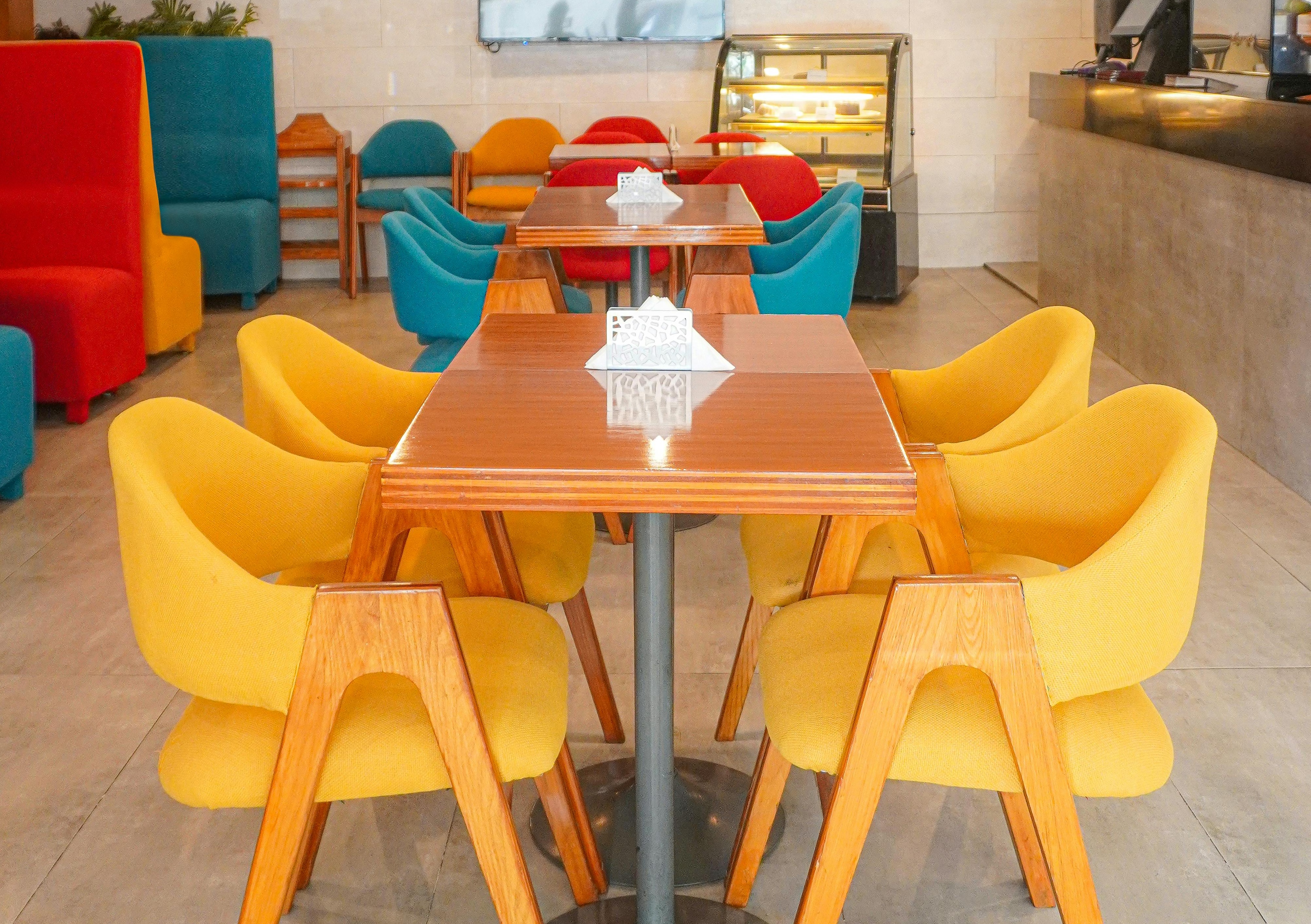
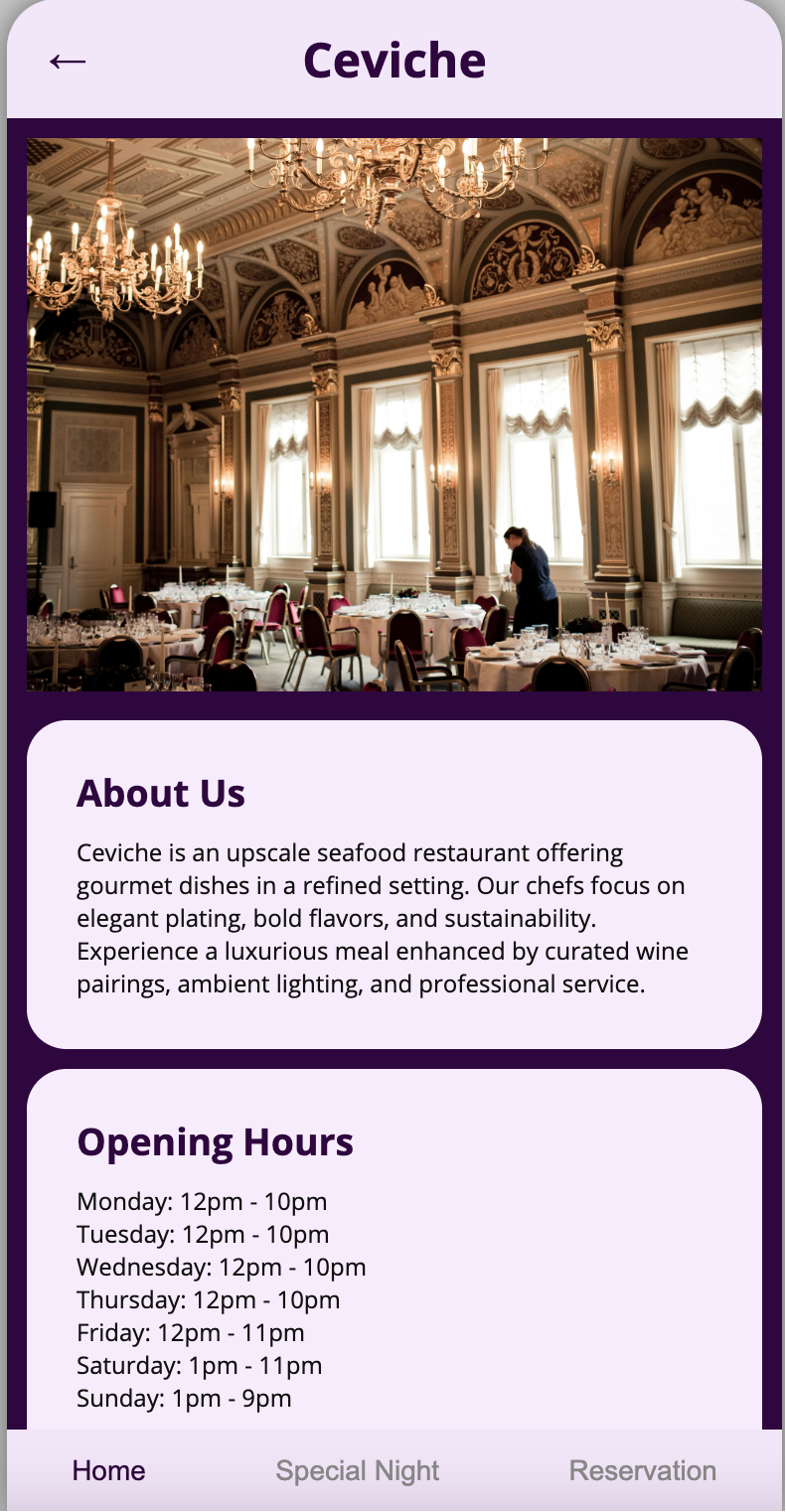
Branded Detail Pages

Each restaurant page uses its own imagery, voice, and atmosphere while preserving a stable layout for hours, contact details, and supporting content.

03

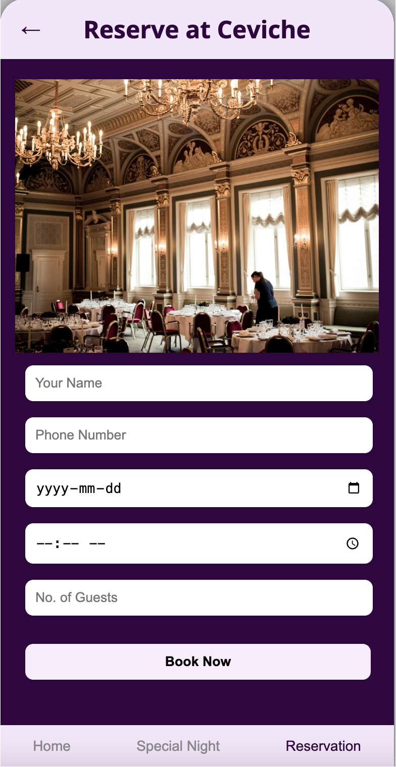
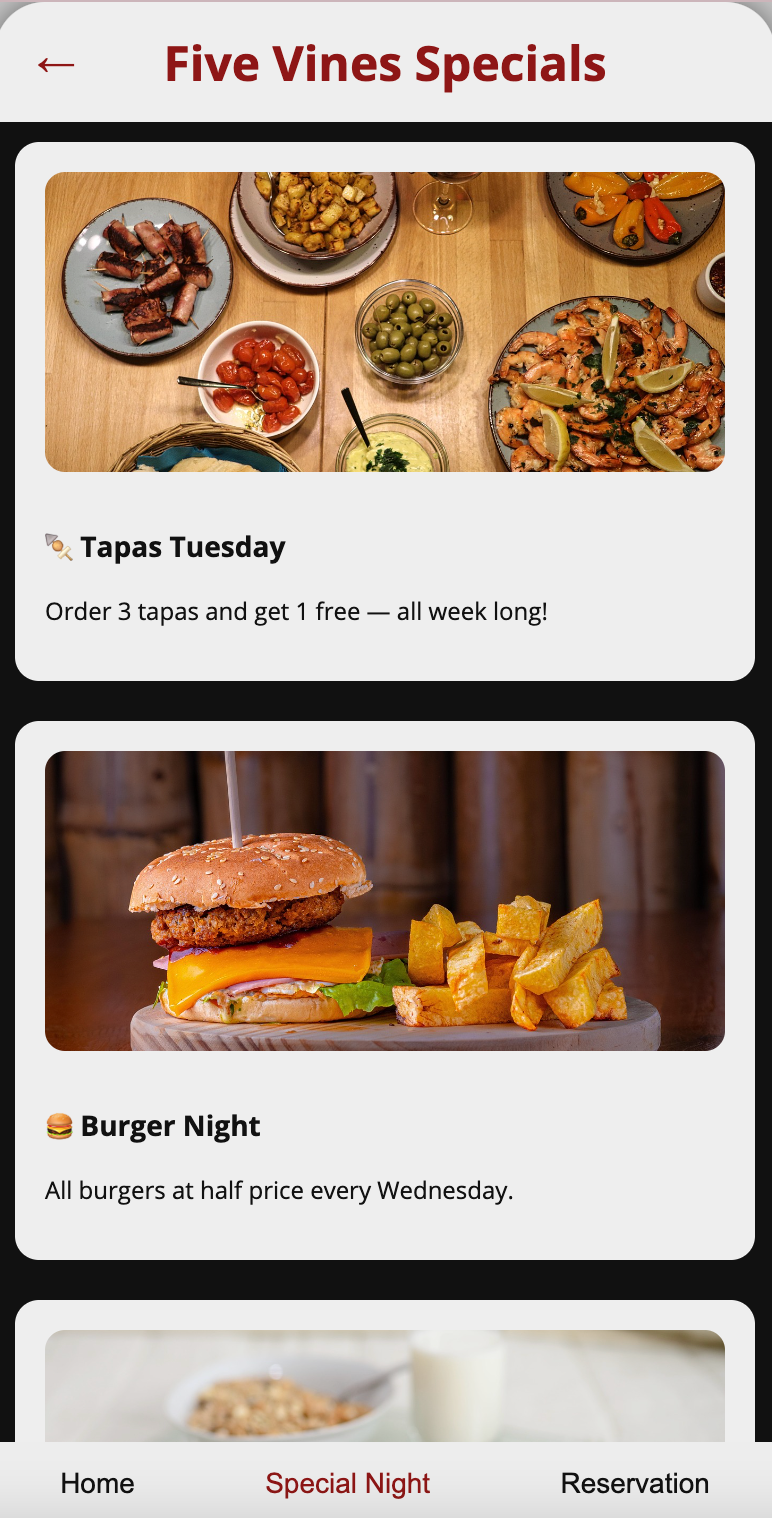
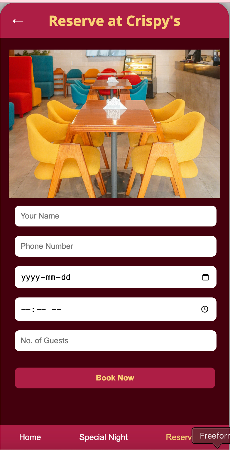
Specials and Reservations

Promotional nights and booking flows create a clearer user journey beyond simple browsing, making the app feel closer to a usable restaurant product.

04

Responsive Motion

GSAP animation and screen transitions were used to give the experience more polish while the interface remained legible across phone and desktop viewing.

Live Experience

Embedded App Preview

The live build is embedded inside the case study so users can test the restaurant switching flow, the page hierarchy, and the reservation pattern without leaving the portfolio.

  • Format: Browser-based restaurant web app
  • Focus: Brand switching, restaurant discovery, and booking flow
  • Build: HTML, CSS, JavaScript, and GSAP animation
Launch Full Experience ↗

Process Assets

Wireframes, Prototype, and Motion Study

The supporting visuals below make the workflow easier to follow from early layout planning into prototype testing and the final animated demo.

Family of Eateries wireframing board
Wireframe Planning Early screens focused on information hierarchy, restaurant switching, and the basic reservation journey before the branded interface was applied.
Family of Eateries prototype board
Prototype Board High-fidelity prototype screens helped test how the system behaved once the brand layers were introduced.
Motion Walkthrough A short recording of the app in motion shows transitions, page flow, and how the experience feels beyond static screens.

Prototype Screens

Selected Mobile Interfaces

Instead of stacking every artboard in one long column, the prototype screens are grouped below as a tighter gallery to show the main interaction states more cleanly.

Family of Eateries prototype entry and selection screen
Entry and Selection The opening screens establish the app identity and guide users into the restaurant selection flow.
Family of Eateries prototype restaurant detail screen
Restaurant Detail View A branded content screen combining imagery, copy, and structured restaurant information in one mobile layout.
Family of Eateries prototype promotional content screen
Offer Presentation The interface extends into promotional content so the restaurants feel active and event-driven instead of static.
Family of Eateries prototype reservation screen
Reservation Pattern The booking form condenses the essential information needed to move from browsing into action.
Family of Eateries alternate brand prototype screen
Alternate Brand Variant The same product structure adapts to another restaurant identity without losing consistency in layout and hierarchy.
Family of Eateries mobile prototype screen showing another brand state
System Continuity Repeated navigation patterns and page logic help the user recognize the app as one connected ecosystem.

Process

Design and Build Approach

The project started with wireframe planning and brand brainstorming, then moved into a high-fidelity prototype to test how three restaurant identities could live inside one app. From there, the design was translated into front-end code with responsive layout rules and animated transitions to give the experience more energy.

Deliverables

What The Project Includes

  • A multi-restaurant browsing and reservation web app
  • Three distinct restaurant brand directions inside one system
  • Wireframes and a high-fidelity prototype sequence
  • Animated front-end behavior using GSAP
  • Responsive layouts for desktop, tablet, and phone viewing

Tools Used

Adobe Illustrator FG HTML5 CSS3 JavaScript GSAP